We’ve been in a bull market for many years now.
I know this bull has made you money. And that’s great. But it may be bad, too.
It can be bad because if it stops, you can’t rely on recent experience for your next steps.
You may think the government’s going to jump in and print some more money to make it continue. And I’m sure it will try.
But it can’t lower interest rates. The fed funds rate is as low as it goes already.
That’s why it can pay to perform this type of analysis…
The Importance of Patterns
People who have lived through bear markets know this concept. So do short-term traders.
It’s helpful to try to determine when you’re near the end of a trend. When a trend reverses, it can be lucrative if you get in early.
One way to do so is to look at patterns.
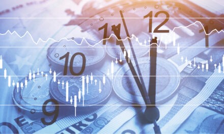
Check out this one:

(Source: Bloomberg.)
When you look at this image, you should see a pattern.
When the 10-year Treasury yield (green) rises, gold (ditto) tends to fall. And vice versa. It’s not perfect, but it happens more often than not.
Remember, the Treasury yield moves opposite its price. It’s like the dividend yield on a stock. It’s equal to the payout divided by price.
In November 2018, the 10-year yield peaked above 3%. Then, as the fed funds rate fell, it began a steady descent to about 0.5% in August of last year.
The gold price moved up as the yield fell.
When the yield stopped falling, gold stopped rising. It peaked at above $2,000 an ounce.
It trades for a bit more than $1,700 now. That’s a 15% drop in eight months.
Next Steps
I’m watching the relationship between 10-year yields and the gold price.
At this point, I have no reason to believe it won’t hold up.
As the chart shows, gold and the 10-year yield tend to move opposite each other.
And when you’re looking for the start of an uptrend, you should watch the 10-year.
If its yield starts falling, I expect gold will rise. That’s what it has done in the past.
So, what pattern should we watch for the stock market?
We can watch the earnings yield. This is the inverse of the price-to-earnings ratio. It is earnings over price.
It tends to move opposite the S&P 500. It can also signal tops and bottoms.
Until recently, the market’s lowest earnings yield was at the end of 1999: 3.25%. (I am using Bloomberg data back to 1980.) It approached that level during the financial crisis, but never fell below it.
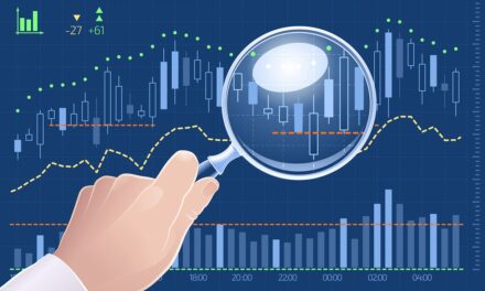
The market broke that record at the start of this year, though. The earnings yield fell to its lowest level in more than four decades:

(Source: Bloomberg, internal calculations.)
It remains there today. Earnings yield is the orange line.
This doesn’t mean the market will fall in a day. But it means it’s at a historic level. Stretched.
And, per its pattern in the past, it may reverse in the near future.
So, we need to watch this pattern. It can make us money when it reverses.
Good Investing,

Editor, Profit Line