Merry Christmas!
Today is a day to reflect on the gifts given to us, and to continue that giving spirit throughout the holiday season.
Being in the holiday spirit, I want to give you a gift about the market today.
It has been an extremely turbulent month. The market is set to finish the year negative for the first time since 2015’s slight decline.
Times like this can be troubling as an investor.
It can be discouraging and tempt you to walk away from the market, cutting your losses and not looking back.
I know the feeling.
That’s why the gift I wanted to share with you this Christmas is a chart that will bring encouragement during this turbulent market.
It’s a chart I came across a few years ago. I have been saving it for the ideal time to share it with you.
Today is that day.
This one simple chart will put in perspective the current volatile market and tell you what to expect in 2019 and beyond.
1 of the Most Powerful Stock Charts to Understand
Before I share the chart with you, let me explain something about it.
It’s not a short-term chart.
The chart looks at the Dow Jones Industrial Average since 1899.
Most commentary and analysis look at short-term trends in the market. These could be anywhere from a few weeks to a few years.
But, as you’re about to see, this chart shows the trends for decades. That makes it one of the most powerful charts to understand.
And right now, it is signaling the bull market has a decade left in the tank.
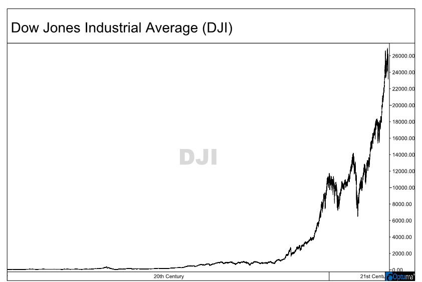
You may not think so if you view a normal chart like this:

This chart makes it look like our growth is unsustainable, and that the market could come crashing down at any moment.
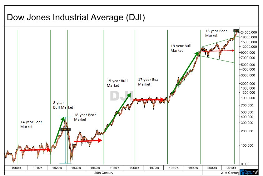
However, all you have to do is adjust the price column to logarithmic form, which shows price on an equal percentage basis, and you get an entirely different picture.
One that tells us a lot about the current bull market we are in.
Take a look:

In this chart, I have annotated the key trends I wanted to show you.
You’ll notice there are long bull and bear markets I highlighted that don’t coincide with a typical bull or bear market.
Many will pick the short-term swings looking for quick bear markets, like we saw from 2007 to 2009, peak to trough.
But this chart shows that bull and bear markets each last much longer. It’s more about periods of consolidation and expansion instead of a specific percentage move.
For example, in the 18-year bull market in the 1990s, there was a 40% drop within it. But when looking at the explosive growth before and after the drop, we can see we were in a persistent bull market.
This is similar to where the market is today. And it’s why this current decline is an excellent opportunity to add exposure to the stock market.
We’ve Been Here Before
The market just came out of a 16-year bear market in November 2016.
That makes this current multiyear bull market just over two years old.
A key reason for this is the “megaphone pattern” the market created during the last bear market. November 2016 is when we finally broke out of that.
The previous three bull markets, measured the same way, have gotten larger and longer than the previous one.
The first was eight years and a 400% increase.
Then a 15-year bull market and a 450% increase.
The one in the ‘90s was an 18-year bull market and a whopping 1,000% increase.
If today’s bull market is just half of the previous one, we have another 400% increase waiting, and seven more years before the next persistent bear market takes hold.
I know it seems impossible at the moment. All the factors seem to align for an extended bear market.
But with history as our guide, we’ve been here before. And the market has thrived for longer than many thought possible.
That will begin in 2019 with a significant rebound for the stock market.
With that, I want to wish you all a Merry Christmas and Happy Holidays.
Regards,

Chad Shoop, CMT
Editor, Automatic Profits Alert


