

Then you decide to go 10 miles per hour faster. Then the radio plays some forgotten song — maybe a Tom Petty and the Heartbreakers tune — and, soon, you’re driving at an unsafe speed.
You can apply that same idea to the stock market. But, in the case of the stock market, it’s impossible to know what the “speed limit” is. So, we develop indicators and look for rare signals.
The chart below shows a rare signal that just triggered. It’s the seventh signal since 2002. It’s saying the odds of a market sell-off just increased.
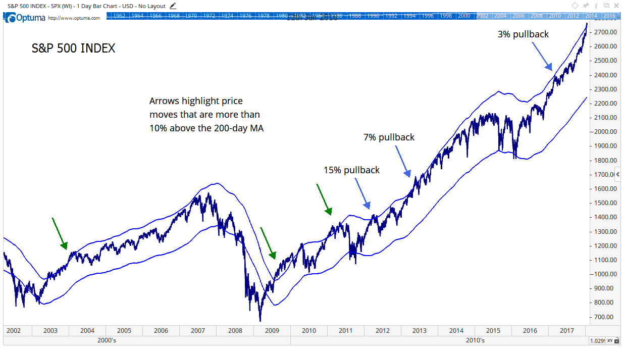
The chart shows bands drawn 10% above and below the 200-day moving average (MA). Those are the blue lines. When the price crosses the upper band of the moving average, stocks are going much faster than normal.
This can be good or bad.
If prices break the upper band after a bear market, that’s a signal the bear market is over. Those are the green arrows. That happened three times.
The blue arrows show when the S&P 500 is in a bull market and going too fast. All three of those signals led to pullbacks. But the most recent pullback wasn’t significant.
A new signal occurred on January 4. It’s a bull market. That signals a pullback is likely.
Back to the driving analogy. You’re on the highway at more than 100 miles per hour, and not even moving your foot over the brake pedal.
If the road is straight and there’s no traffic, you should be OK. But if something goes wrong, the outcome will be catastrophic.
Well, that’s where we are in the stock market.
Regards,
Michael Carr, CMT
Editor, Peak Velocity Trader