
Two averages in the market are on the verge of crossing.
The ramifications of such occurrence are worrisome.
The only time it occurred in the last decade where it didn’t lead to a period of increased volatility was October 2014 — it just had one dip and rallied from there.
The other periods this cross of averages happened were before the volatile stretch at the end of 2015, prior to a rough patch in the middle of 2011, before a wild 2010 and, of course, the cross came prior to the bear market from 2007 to 2009.
That’s why the chart below has my attention. Let me explain.
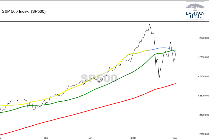
What you are seeing on the chart are three moving averages.
The red one is a simple 200-day moving average. The green line is the 50-day moving average, and the yellow line is the 50-day moving average offset by 25 days. The blue line is my forward indicator for the yellow line because the data continues to change until it is 25 days old. At that point, it is our 50-day moving average offset by 25 days (the yellow line).
As you can see, the blue line, my forward indicator, recently dipped below the 50-day moving average (the green line).
Now, it could pull back above the green line, and that would be a bullish signal. But assuming the yellow line follows the blue line and eventually heads below the 50-day moving average, that is a bearish signal.
That’s the cross that has occurred several times over the last decade, with only one occasion when it was a quick dip. The rest of the crosses were shadowed by increased volatility in the stock market.
And, like all moving averages, these will be breached before a bear market.
That’s why this is a chart I’ll keep a close eye on in the coming weeks, as it could be giving us an early warning to a looming bear market.
Regards,

Chad Shoop, CMT
Editor, Automatic Profits Alert