
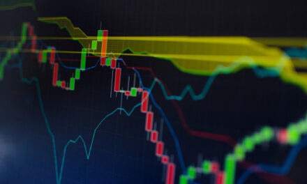
If you want to know the state of the market at a glance, just look to the clouds…Now, before you institutionalize me, I’m not talking about the fluffy white cotton floating in the sky.I’m talking about Ichimoku cloud charts, a technical indicator developed by Japanese business writer Goichi Hosoda in the 1930s. I first learned about these charts at a conference in New York about a dozen years ago. The speaker said Hosoda was so frustrated with market forecasting tools that he decided to dedicate his time to finding something useful.The story goes, his team rented space in a windowless warehouse and got to work. Using price data from old newspapers, they tested countless different methods for forecasting market trends. (Keep in mind this was long before the age of computers, and involved a lot of manual calculation.)Then one day, the breakthrough came…
Hosoda’s Breakthrough
A moving average is an indicator that’s commonly used in technical analysis. It smooths out random, short-term price moves to give you a clearer long-term trend.But in that windowless warehouse, Hosoda realized that no single moving average provides a full view of the market.For that, he discovered, you need to add “midpoints.”The midpoint is the average of the day’s high and low. Using midpoints along with different lengths of moving averages, Hosoda created charts that show the state of the market at a glance — hence the name Ichimoku, which literally translates to “at a glance.”Because Ichimoku clouds offer so much information, they can be intimidating to new traders.Let’s break one down together…Take a look at the 13-minute chart of Affirm (AFRM) below.The buy-now-pay-later company came under pressure when Apple announced its entry into the business a few days ago. But the cloud chart was already bearish before the news broke:

(Click here to view larger image.)
The red- and green-shaded areas in the chart above are the “clouds.”The simplest interpretation is to buy when prices are above the clouds, and sell when they break below them.Prices most recently broke below the cloud on June 8, warning traders to be bearish on AFRM.Unfortunately, however, interpreting Ichimoku clouds isn’t quite that simple.Trading breaks of the clouds will result in big wins — but only when prices are in long-term trends.When prices move quickly through the clouds, this strategy will result in a large number of losing trades.That’s why it’s important to understand the other components of Hosoda’s cloud system…
Let’s Get Technical
There are four other main components of an Ichimoku Cloud…
- A “bar” is each period of time plotted on the price chart. In the chart above, a black bar is plotted every 13 minutes.
- The blue line in the chart is the turning line, or “Tenkan-sen.” It’s the midpoint of the high and low of the last 9 bars.
- The red line is the standard line, or “Kijun-sen.” It’s the midpoint of the high and low of the last 26 bars.
- The magenta line is the lagging line, or “Chikou Span.” It’s the closing price shifted 26 bars back.
The clouds are formed by the turning line (blue) and standard line (red).The upper boundary of the cloud is the midpoint of the two lines shifted 26 bars forward. Let’s call it “A.”The lower boundary of the cloud is the midpoint of the high and low of the last 52 bars shifted 26 bars forward. We’ll call it “B.”The cloud is green if A is above B. It’s red if A is below B.I’ve already mentioned one way to interpret the chart. If the price closes above the clouds, the chart is bullish. When prices are in the clouds, the signal is unchanged. If the price drops into the cloud after a buy signal, the chart remains bullish until prices drop below the clouds, at which point it turns bearish.But there are other ways to trade Ichimoku clouds. Some traders, for example, use the turning line and standard line for signals.The turning line is faster, since it’s calculated with 9 bars. When it’s above the slower line, or standard line, that’s a buy signal. When it’s below the slower line, that’s bearish. This is very similar to a moving average strategy.More conservative traders, on the other hand, tend to focus on the lagging line.When this line crosses above the clouds, it’s a buy signal. Sell signals occur when it falls below the clouds, while time in the cloud is ignored. Because this line is 26 bars behind the price action, it profits during big trends.Many traders look for two or even three of the signals before acting. This can help identify the safest trades.The Ichimoku cloud is a versatile market forecasting tool. Most people have heard of it before. But then, they try applying them to a chart once… get scared, and quickly revert to a simpler indicator.It’s a complicated system. Not even I can fully explain Ichimoku clouds in one go. That’s why I’m making this a three-part series.These charts offer a lot of information at once. It will take time to master them. But if you do, you’ll be able to spot opportunities with greater frequency. Next Tuesday, we’ll look at a detailed example of Ichimoku clouds in action…
Until then, Michael Carr, CMT, CFTeEditor, True Options Masters
P.S. There’s a good reason I bring up Ichimoku clouds right now.My colleague Andrew Keene, who joined True Options Masters this year, commands a special mastery over Ichimoku clouds. But he takes it a step further, combining them with his SCAN system to find low-risk/high-reward options trades every single day.So far this year, Andrew has a 71% win rate trading only call options in a bear market. And soon, he’s going to show you how he does it.You’ll hear much more about Andrew in the coming weeks, including more about his SCAN system and how it works. Keep an eye out for more details…
Chart of the Day:The Bear Market Is Officially On
By Mike Merson, Managing Editor, True Options Masters

(Click here to view larger image.)
While it’s felt like it for months… yesterday’s fall in the S&P 500 officially put the beating heart of American business into a bear market.And it just so happened to place the index right at a rising support line. This line acted as resistance from all the way back to the 2009 bottom, until stocks broke through it in mid-2020.A roundtrip of the post-pandemic rally, albeit painful, seems appropriate to me. So much of the gains in assets across the board were driven by money printing and quantitative easing. Now, the Fed is tightening. We can confirm “Don’t fight the Fed” works just as well on the way up as it does on the way down.The Fed is likely to raise interest rates by 50 basis points this week. Given inflation numbers, I don’t think a 75-point hike is outside the realm of possibility, even though it was “off the table” at the last meeting.With that meeting so close, I expect stocks to chop around this new low for the next couple days before deciding where to settle. I’m not personally interested in the long side until we rise above 3900 again.
Regards, Mike MersonManaging Editor, True Options Masters