

All year, there’s been a huge gap between the performance of market indexes versus the majority of stocks. But now big-name companies like Apple, Microsoft and Amazon are starting to lose steam.
Is that a sign of things to come for the new year?
Could we actually find ourselves in a reverse situation where the hot tech stocks fall, but the smaller stocks gain?
In today’s edition of Your Money Matters, Ted and Clint outline who the likely winners and losers will be as this rotation unfolds and the simple step you should take now to prepare.
More Pronounced Than Ever
The market is already flashing signals that we may see this reversal next year.
Whenever we expect a rotation, it’s always a good idea to increase your cash position … and have your shopping list ready.
Today’s video can help you on both of those counts … and more.
To watch the video, click here or click on the image below:

VIDEO TRANSCRIPT
Angela: Since we are headed into a New Year, we are well into December now, we thought we’d take a little bit of a peak ahead. Now, we know this last year or so, really since spring, it’s been more pronounced, this very uneven market that we’ve been seeing. And we looked at a chart last week, I’d like to take a look at it again, and you can see just how the gains have been concentrated in just the big stocks.
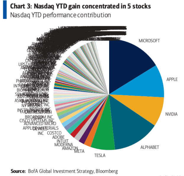
This is the Nasdaq, but I don’t imagine the S&P looks too different from this, but lately, there’s talk that things may be different heading into next year. In fact, not just different, but we might see a complete reversal of what we’ve been seeing.
So let’s take a look at another chart here.
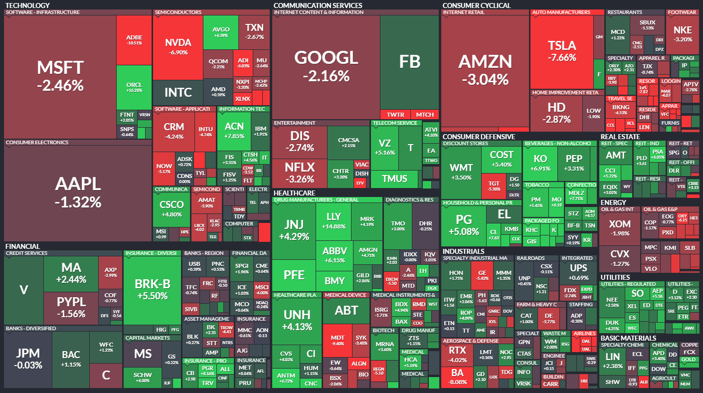
It is nice and color-coded for the holidays, so enjoy that, but you can see these big blocks of red, Microsoft, Apple, Google, down, down, down, and then you see these tiny little stocks all in green. It looks like this is already happening.
So, Clint, if this trend does continue, how do we position ourselves?
Clint: Let’s talk about what’s happened this week, because for a while now we’ve talked about how just a handful of stocks are propping up the overall market. And just this week, I mean, it’s becoming even more pronounced.
So the first chart I want to show, comes from Bespoke, and this is from earlier in the week but it shows different stock market indexes and where they’re at from their highs versus what the average stock within that index is experiencing. So here’s that chart.
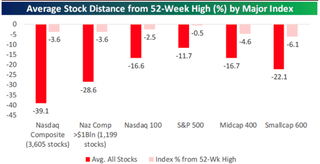
Starting with the left to walk you through this, starting with the Nasdaq Composites, this is just the overall Nasdaq. Earlier this week it was only 3.6% off its high. That’s the lighter red shaded bar. Meanwhile, when you look at the average stock where it’s at from its 52-week high, so over the past year, a drawdown of just over 39% and you can see this across the border. That’s the most extreme example on here.
But if you look at the larger names in the Nasdaq like the Nasdaq 100, it’s only two and a half percent off its high, but the average drawdown of stocks within that, almost 17%.
S&P, you can see was trading just below its all-time high, but the average stock within the index was down almost 12%. And then all the way on the right, I highlight small caps with the S&P Small Cap 600 Index, 6.1% off it’s high at the index level, but the average stock down 22%.
So a lot of stocks across the board are on average hitting. We’re already in the bear market territory and, as I said, this has only gotten worse this week. I actually want to show a chart I used last week just to show you what’s been going on here recently.
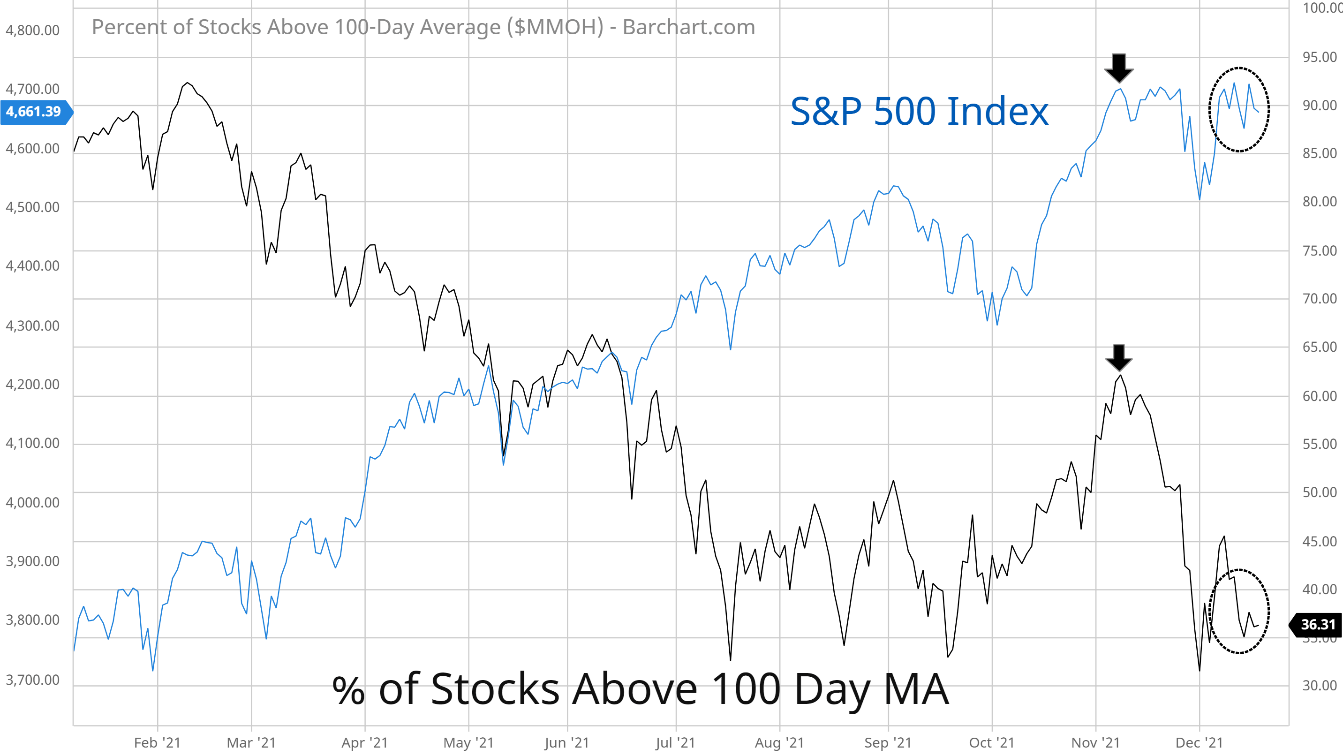
So the S&P 500 is the blue line on here, and the black line is the percent of stocks above their 100-day moving average. That’s just a good way to gauge how many stocks are above or below this intermediate-term major of trend. And look at what’s happened just recently, since really the start of November.
So, at the start of November, as I’m highlighting with the arrows on here, when you had the S&P 500 at a new high, you had this gauge on here, the percent of stocks above their 100 days, it wasn’t anywhere near where it was at the start of the year, but it had recovered and it got back over that 60% level.
But look at what’s happened just this past week. Since it started December, you’ve had this sharp rebound in the S&P 500 back to new highs. But look at this black line on here, it has barely recovered at all and is sitting right around a 36% level right now.
So it just goes to show that this issue with a few stocks propping up the market this year has gotten even worse just over the last two weeks. This is creating some challenges but this is creating some opportunities as well.
The challenge is with what you were showing on that heat map earlier. If you start to see those big stocks start to come under pressure, start to roll over, that’s going to be big trouble for the indexes because of how much now they make up of those indexes.
But at the same time, with the drawdowns that we’ve seen in stocks underneath the hood, that’s creating some opportunities. It’s creating some really big valuation spreads, and here are a couple of charts to illustrate that.
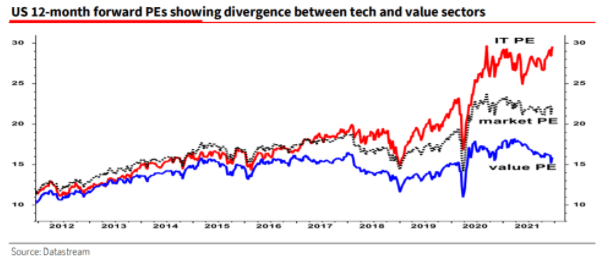
So this one shows the 12 months forward PE, so using forward earnings estimates. For the IT sector, is the red line on here, and the black line is the market overall, but the blue line is value PE. And so you can see how wide this spread has become.
I mean, you look at the blue line, and it’s still trading at levels that we were seeing back in 2015, 2016, and 2017.
Meanwhile, what’s really made the market’s PE take off is what’s been happening in some of those large-cap stocks, especially in the IT sector. Now, this isn’t just something we’re seeing in IT. It’s not something we’re just seeing here domestically. It’s a global issue here as well. So here’s the last chart I want to show.
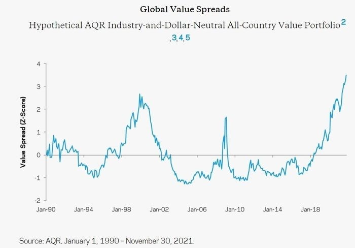
This comes from AQR and this takes an industry-neutral value portfolio and looks at the valuation spread between the cheapest and the most expensive stocks. As I said, this is a global portfolio. It’s about 70% developed, 30% allocated to emerging markets. The valuation measures include things like book yield, earnings yield, and so on, but you can see, we are hitting levels that easily surpass what we saw back in the tech bubble.
So, once again, just illustrating that valuation spread between really expensive stock and really cheap stocks. And like I said, that’s creating some challenges and opportunities because of how much of the indexes those expensive stocks make up versus the opportunities you can start to find now among cheap stocks.
Angela: And speaking of those opportunities, Ted, obviously, anytime you see any kind of rotation in the market, there’s going to be some winners and there is going to be some losers. So who do you think those likely winners and losers are going to be?
Ted: Well, before answering that question directly, I think the unfortunate fact is that the losers are probably going to lose more than the winners win. And that’s why we see a lot of people saying that the average gain for the stock market, U.S. stock market, over the next couple of years is likely to be a lot lower than it has been in the past and that it’s going to reflect this diminishing importance of these high valuation firms.
But let’s just show a chart that shows how extreme it’s got. This chart shows the valuation dispersion between the 20th and 80th percentile of S&P 500 stocks.
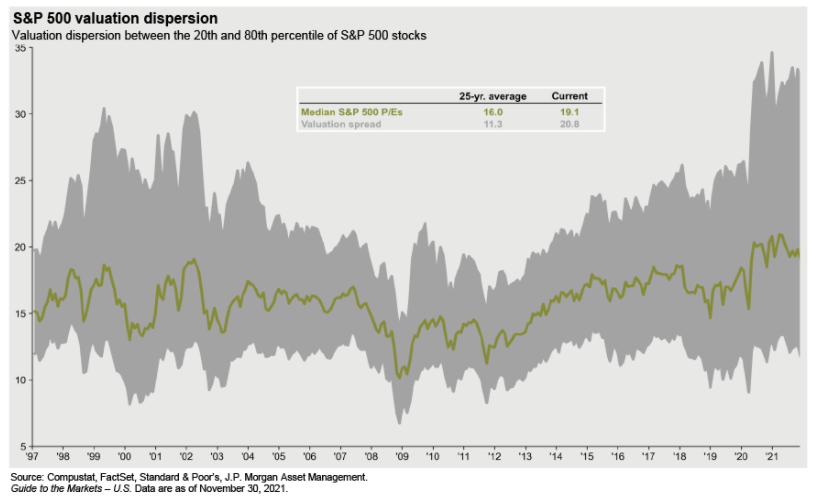
Essentially that big gray blob shows you the spread, the valuation spread, how far apart those two different groups of stocks are. And we’ve got to the point where the current valuation spread is more than double the long-term 25-year average.
We haven’t seen anything like this since the dot-com bust. That’s not to say that we’re headed for another dot-com bust, but it just shows you that what happened after the dot-com bust was that those big valuations came down but it didn’t necessarily mean that other valuations came up to replace them.
So the first message is, get used to smaller returns. That’s the way it’s going to be.
Now, here’s another chart that shows the tech sector again.
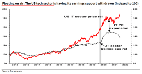
It’s part of that same package that Clint showed, and it shows, what’s really important here is that it’s not earnings growth. There has been some earnings growth since the pandemic started in some of these big-ticket companies, the Googles, the Alphabets, those kinds of companies, but the critical thing is price-to-earnings expansion. That’s the red line. That’s showing you that what’s really happened is that people have been willing to pay more and more for a dollar of earnings of these companies.
The critical thing to look at here is that that red line is still going up, or it has still been going up until recently, but the trailing earnings per share are actually starting to fall. So you’re getting an even bigger gap between what people are willing to pay for a company’s stock and those earnings.
Now, here’s another couple of charts that illustrate this in a different way, but it’s quite striking.
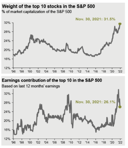
If you look at the weight of the top 10 stocks in the S&P 500 as a percentage of market capitalization, we’re basically in uncharted territory. At the end of November, it was over 30%. If you look at the earnings contribution of the top 10, it was also quite high, but it’s starting to fall. So, eventually, gravity’s got to catch up with these top companies. I mean, you can’t have a situation where their relative earnings growth is declining and their stock prices is rising. So they got to come down.
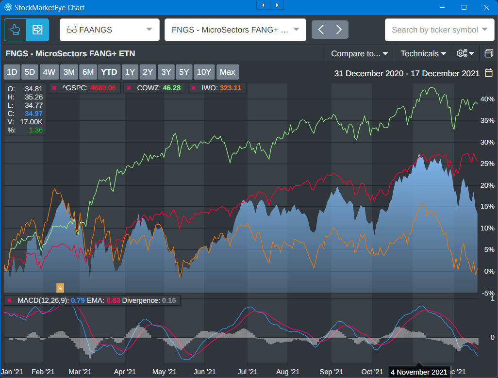
Here’s another chart that shows the FNGS.

This is an exchange-traded note called F-N-G-S, and that’s the blue area, and it shows, it’s in comparison to the red line, which is the S&P 500. So what I’ve highlighted on the right is the big gap that’s opened up between the FNGS and the market in recent weeks. Down at the bottom, you’ll see that that’s on the basis of relatively lower trading volumes, so it’s not like there are big selloffs. It’s just the people are not enthusiastic about these stocks anymore.
And then, finally, at the bottom, Clint’s favorite measure, MACD. We’re solidly in pretty negative territory. I would argue that we’re probably going to head even lower on that, so they’re getting oversold.
The question is, where’s the opportunity?
So one more chart on this before I show you a table. This is a chart that shows the S&P in red.
It shows, again, FNGS, which is a proxy for the big FNG stocks in blue. It shows IWO, which is small-cap growth stocks in orange, and then, importantly, it shows cash cows. In other words, companies that generate a lot of free cash flow, which as you know, is one of my favorites.
I mean, basically, this is over a year to date. There’s just no comparison. You can see that both the high growth, small-cap stocks have really fallen off a cliff since the beginning of November. So have the FNGS. The market continues to try to go up but look at the outperformance. I mean, basically, that is quality companies that produce lots of cash.
Now, here’s a table that shows the relative valuations of these types of firms.
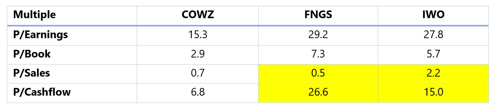
On every measure, the cash cows, and that’s an ETF called COWZ, and on every measure, whether it’s price to earnings, price to book, the only one where cows is a little more expensive is in price to sales. That doesn’t worry me too much, because it’s still a very low number.
But look at price to cash flow. I mean, basically, people are willing to pay huge amounts of money for cash flow that is inferior to other companies. And eventually, that’s got to catch up to them. I’ve highlighted in yellow just this enormous difference between the price to sales and price to cash flow, both for IWO and for FNGS. And what that tells us is that although sales are continuing to grow, cash flow is not growing as rapidly, and that’s because input costs are rising. So these companies’ margins are starting to get squeezed. That’s what this is all about.
The next chart shows just the last four weeks just to amplify this.
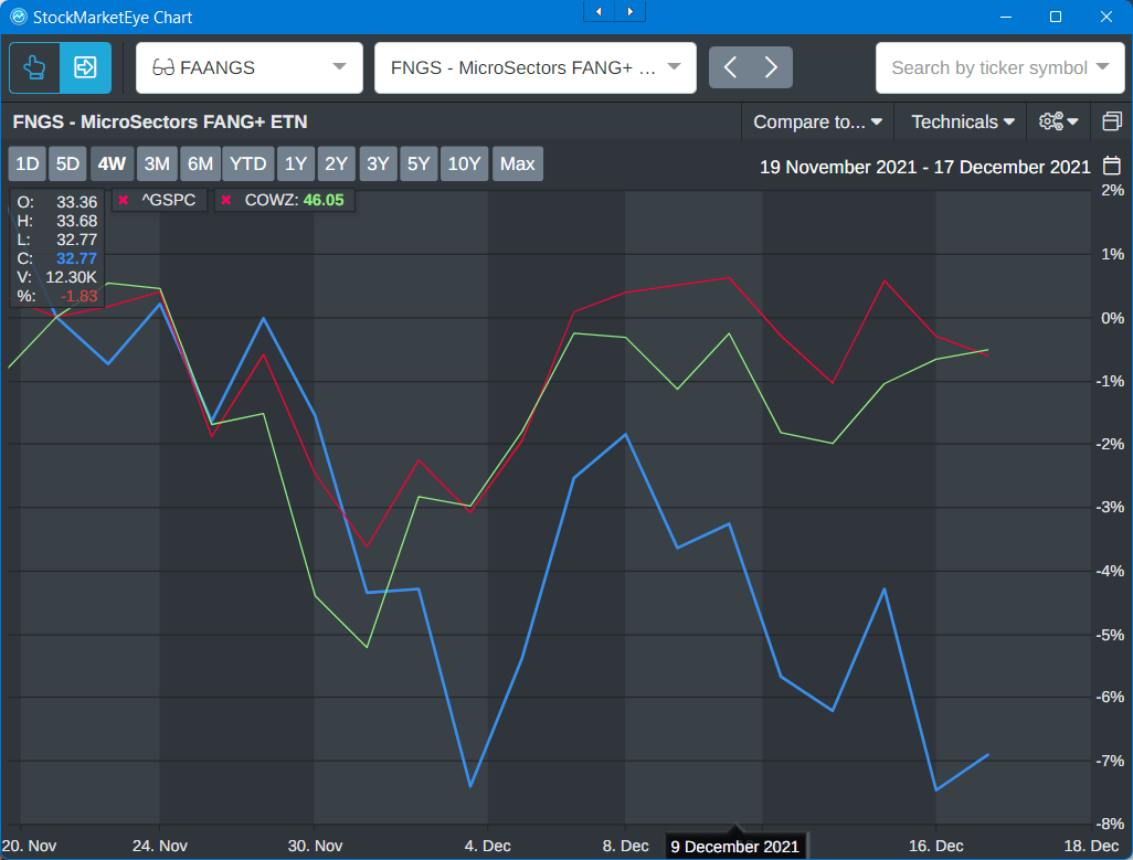
Again, you’re seeing a big decline in the FNGS, but you’re seeing that the cash cows, the companies that deliver lots of actual cash flow, are rising and are really at this point just starting to outdo the market as a whole.
The last thing I want to show you is that this is not the first time this has happened. Here’s what happened after the dot-com bubble collapsed.
And what it showed was that the companies that were undervalued outperformed very significantly, almost by a 40% difference over the next couple of years compared to the S&P 500. So it’s not like everything went down when the bubble popped. A lot of companies went back up.
The point is that they’re probably not going to go up by as much as these other companies have gone down, which leads to a couple of different recommendations.
I’ll start with mine and then Clint can jump in as well.
The first thing is, if we are expecting a big rotation it’s probably a good idea to increase your cash position so that you can take advantage of this rotation. You can start moving into some of the stocks. And a good way to do that would be to start taking profits on those companies that have become overextended.
For example, I think if I held Apple right now, I’d probably sell a big chunk of it, take the money, the profits that I made, put it on the sidelines until we get some clarity as to exactly which companies are going to start rising. But I do think that that’s going to be mainly defensives and companies that generate good cash flow.
So here’s a chart that shows what happened basically over the last 20 years whenever the Fed raised its fund rate, which is really what’s driving a lot of this.
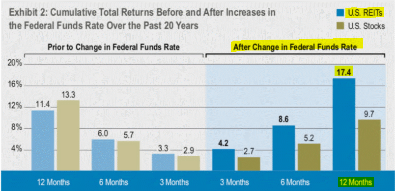
The biggest 12 months gain after the Fed raised its interest rates came in REITs, which are the classic example, my favorite example, of cash-producing companies, and particularly in an inflationary environment where you have a lot of these companies able to raise rents, your triple net lease rents and things like that, above the rate of inflation or at least to cope with it, that’s what you want. So, that’s certainly where I’m looking to put my money.
Angela: And Clint, what about you?
Clint: What I would look at right now is what I was showing with that first chart, go look at those stocks that have been taking a hit this year and start to build out a shopping list, because, I mean, look, we could still see some more selling pressure in those names just over the next couple weeks as people are tax-loss harvesting. That’s coming into play.
But a lot of times what you see is those stocks that have done the worst over the past year tend to have a really good start to the subsequent year in 2022.
So that’s where I would be looking across these indexes to look at where to deploy some of that cash if you’ve been raising cash to start the year.
Ted: One caveat I’ll just add to that. When you do that, don’t just look at the price, make sure you look at potential earnings growth and if they’re making money, margin growth. Because, again, the market is shifting to a position where it’s rewarding companies that are starting to generate actual earnings. They’re not going to reward speculative what might happen in 10 years’ time. They want companies that are growing fast now. So look for the small ones. Look for the ones people are ignoring.
If you like today’s video, leave a comment or email us at BaumanDaily@BanyanHill.com.
Kind regards,

Angela Jirau
Publisher, The Bauman Letter