
Is it over?
Ever since falling into bear market territory on June 13, the S&P 500 has clawed back to not officially being in a bear market.
Since the index pulled back from that 20% decline threshold, many investors have been wondering if the worst is behind us.
After all, some of the most beaten-up segments of the stock market have managed a respectable rally over the past two weeks … like small-cap growth shares.
And it sure feels like the market has gone down for a long time … so we must be due for a rally, right?
But before you get too excited that the worst is over, you need to see this chart first.
New Bull? Not so Fast…
As nasty as this bear market has felt, you haven’t seen anything yet.
Take a look at the chart below from Bank of America’s research department:
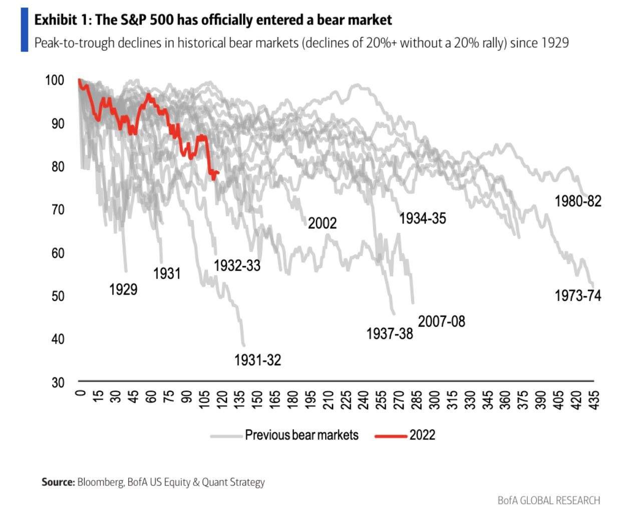
It shows every bear market in the S&P 500 going back to 1929, plotting out how deep and how long each bear lasted. The red line is the current market, while the grey lines are all the other instances.
Some bear markets end quickly, but others have lasted far longer than our current seven-month downturn.
Like the 1973 to 1974 bear when the S&P 500 fell nearly 50% and lasted over 400 days!
So what’s the difference between a quick ending versus a nasty prolonged bear market?
You’ll notice that the more severe downturns took place when the economy also fell into recession.
In fact, research shows that bear markets experience a sharper drawdown when a recession hits, averaging a decline of 35% instead of 24% when a recession is avoided, according to the folks at LPL Research.
Now, the economy isn’t in a recession … at least not yet. And there’s one more chart I’m watching to know if one is around the corner and if the bear has room to run.
Stay Ahead of the Curve
I’ve talked a lot this year about monitoring signals coming from the fixed income markets.
I already highlighted one metric to track recession probabilities here.
Here’s another signal to watch coming from the bond market, and that’s with the yield curve. A yield curve plots the spread between two Treasury securities of different maturities. When a short-term yield rises above a long-term yield, that’s called an inverted yield curve and can signal recession.
That’s because an inverted curve means that the Federal Reserve is raising short-term rates, while longer-term rates fall due to growth concerns with the economy. Sound familiar?
You’ve probably heard chatter recently about the 2/10 yield curve inverting again. But here’s the thing … there isn’t just one single yield curve. There are lots of them, and there’s one I put more stock (no pun intended) in than any other.
I prefer to watch the spread between the three-month and 10-year Treasury yield. And while that spread has been narrowing, right now it’s still a long ways from inverting as you can see below.
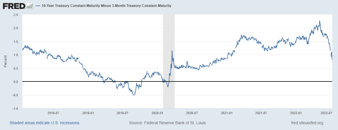
So put this metric at the top of your list to monitor. I don’t know if this bear market is over yet, but the evolution of recession signals is one way to know that the worst is behind us … or lurking ahead.
Best regards,
Research Analyst, The Bauman Letter