
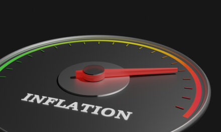
Finally, some good news.Inflation has dropped… a little.In April, the Consumer Price Index (CPI) rose 8.3% compared to a year ago.That’s not “good” necessarily — but it’s not as bad as March, when CPI rose 8.5%.As a consumer, even a slightly lower number is welcome. And some analysts expect inflation to go even lower over the next few months. That’s because of how CPI is calculated.Economists pore over a number of factors to create their forecasts. They know double-digit increases in foods like margarine, butter, meat, and milk aren’t sustainable. Companies can’t keep raising prices that fast, so price increases will slow.They also consider the relationship between gasoline futures, refining costs in the summer, and the price at the pump.In other words, these models are complicated. There are 339 line items included on the full inflation report.So for these incredibly contrived reasons, economists think it’s possible the year-over-year growth in CPI will drop below 8% in June.The problem is, these forecasts are based on dozens of assumptions, not facts.Economists can get away with that — but traders can’t. Unlike economists, we need to be right to make money.And based on my forecast, economists are dead wrong on inflation right now.
How the Greed Gauge Helps Forecast Any Chart
I spent years building complex models like those used to calculate CPI, before I realized a critical flaw…If one assumption is wrong, the whole forecast is wrong. And these kinds of models are riddled with assumptions.It’s much more reliable to create a simple model based on facts.Here’s one I’ve created to help forecast inflation:

(Click here to view larger image.)
This chart shows the high-inflation era of the 1970s and early ‘80s.The CPI is at the top of the graph. The 12-month rate of change (ROC) of CPI is in the center.This ROC, not the CPI, is what we really think of as inflation. As the top of the chart shows, prices are always rising. We just notice it more when it’s happening quickly. The ROC tells us how fast we’re feeling the pain of these price hikes.At the bottom of the chart is the Greed Gauge, an indicator I developed to measure momentum in stocks. When applied to stocks, red is “bad” because momentum is slowing. It correlates to fear. Green, conversely, is “good” because momentum is rising. It correlates to greed.But green isn’t “good” when you apply the Greed Gauge to inflation. It means that momentum in the ROC of inflation is still strong.The chart shows that changes in momentum preceded changes in the ROC of CPI. In the recessions of 1974 and 1980 (the first two gray shaded areas), a stalling Greed Gauge predicted a fall in the ROC of CPI.In 1982, after the Greed Gauge turned from green to red, ROC fell rapidly.But that’s not what we’re seeing today…
The Greed Gauge Says Inflation Will Worsen
Today, analysts believe inflation could go lower over the next few months. They think consumers won’t accept higher prices on the shelves and at the pumps.But my Greed Gauge shows something different…Take a look at this chart of the current day:

(Click here to view larger image.)
Even though CPI came in lower in April, the Greed Gauge hasn’t confirmed that inflation is falling. The Greed Gauge is printing a bigger green bar despite this month’s lower number.A long-term view shows that the Greed Gauge has never been this high. It’s not stalling, like we saw in the 1970’s before the ROC of inflation began to drop.If this trend continues, there’s no reason to expect price increases to slow — outside of the assumptions economists like to rely on.Based on that, we know this time is different than the 1970s. My biggest worry is that this time could be even worse.
Regards, Michael Carr, CMT, CFTeEditor, True Options Masters
Chart of the Day:The American Dream Crushed, in One Chart
By Mike Merson, Managing Editor, True Options Masters

(Click here to view larger image.)
To me, this is probably the scariest chart in the market right now.This is the U.S. National Home Price Index — a benchmark of the cost of single-family homes in the U.S — charted against median household income.There’s not gonna be much fancy chart analysis today. This chart is simple to interpret… it’s parabolic. And this is pricing out an entire generation of would-be homeowners.We’ve never seen this ratio increase this much, this quickly, for as long as data has been available.There are a number of factors at play here. As Mike Carr pointed out in Options Arena a few weeks back, housing supply in the U.S. is deadlocked thanks to the “NIMBYs” who aren’t in favor of bringing new low-income housing online.It’s also no secret that major financial institutions can and have been buying up single-family homes en masse. With virtually unlimited capital and a bigger tolerance for high mortgage rates, these institutions can outbid any individual buyer.And accelerated inflation is certainly playing a part.If you own a home, hold on to it for dear life. Especially if you’re financing anywhere south of 4%.And if you don’t, and want to buy, try looking outside the coastal cities. There are still deals to be found. You just have to stomach small towns and major renovations. As for what happens next, it’s hard to imagine this chart getting much more parabolic. Housing prices move slow, but I wouldn’t be surprised to see prices come in quicker than expected if and when inflation begins to slow.
Regards, Mike MersonManaging Editor, True Options Masters