


A general cannot win a war by himself.
Leadership needs troops supporting the effort to win the battle. If the troops don’t follow the general, the leader is likely to meet a grim fate at the hands of the enemy.
In the stock market, a few stocks are always considered the market “generals.”
In the current market, the generals are the tech stocks like Facebook, Apple, Microsoft, and other big names.
The five largest tech stocks account for about 19.8% of the S&P 500. Just those five stocks could drive the larger trend in the index.
Here’s the problem…
Right now, the troops are straying away from the generals.
And in doing so, they’re leaving the whole unit exposed.
Perspective on Breadth
Mike Merson and Chad Shoop wrote about breadth yesterday. They rightly observed that, from a short-term perspective, fewer stocks are participating in the longer-term bullish trend.
But today I want to take a longer-term look at breadth to put the recent weakness into context, and help you understand the current state of the market.
Let’s start by defining “breadth.”
Breadth is a measure of the health of the broad trend. The more stocks participating in long-term bullish technical patterns, the better the breadth.
In other words, breadth indicators calculate how many troops are following the generals.
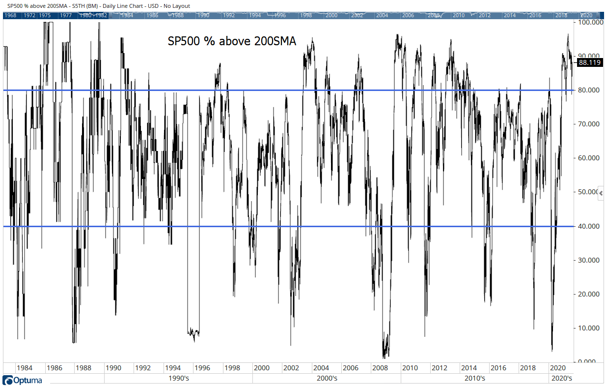
There are a lot of ways to do that, but they all tend to give the same answer. A simple one is the portion of stocks within the S&P 500 trading above their 200-day moving averages (S5TH). That’s the indicator Mike looked at yesterday.
So let’s take a longer-term look at that indicator. Check out the chart below…
(Click here to view larger image.)
This chart shows that indicator since the 1980s. Most of the time, between 40% and 80% of the stocks in the Index are above their 200-day MA. Those levels are marked by solid blue lines.
Put in this context, the current reading of 88% is unusually high.
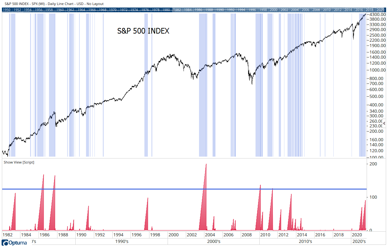
When I look at data, I want to understand what happens at the extremes. In this case, I want to see what happens when more than 80% of stocks are trading above their 200-day MA. That’s shown in the next chart.
(Click here to view larger image.)
This chart shows the S&P 500. The blue shaded areas highlight times when more than 80% of stocks were above their 200-day MAs. The red bars at the bottom show the amount of time breadth remained at these levels.
That chart shows high breadth readings are bullish for the stock market. It also shows that when breadth is high for 125 trading days or more (the solid blue line), we should expect a significant pullback. The current peak is at 90, indicating breadth isn’t a real cause for concern for another month or two.
Though, breadth could reverse at any time — as you can see, this occurred multiple times in 2013, 1997, and 1983.
But it tends to change slowly. In military terms, it takes time to change the direction of an advancing army on the battlefield.
For now, the long-term breadth picture supports more new highs in the major market averages. But we should take note of the recent unwind in breadth this year as a warning sign of a pullback to come.
Regards,
Michael Carr
Editor, One Trade
P.S. Pullbacks can be scary for individual investors. In that kind of environment, almost no stock is safe from the broad market’s moves.
That’s why, a couple years back, I started testing an indicator I invented on all the broad market indexes. It would allow me to predict what the market was likely to do in the next 10 days.
After testing this indicator over 100 years of data, I found this index to be the best candidate.
When I started sharing trades with this indicator with my subscribers during the COVID-19 crash last year, we booked gains of 75%, 110%, and 313%.
I think we might soon face a period of similar volatility. So if you’re serious about protecting your portfolio, click here and learn more about this technique.


