The market action in the past two weeks has left many traders curled up in the fetal position under their desks. Some covered in their own puke.
But you might be made of sterner stuff. You also might be a longer-term investor. In which case, I have three charts you really need to see.
Because they could fatten your wallet.
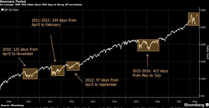
First, this correction isn’t over. At least, if history is any guide. Take a look at chart No. 1, which I grabbed from my Bloomberg terminal.

As you can see, history tells us that recoveries take time. In this bull market alone, it’s taken almost 200 days on average for equities to claw back from prior corrections.
So, if next week the market recovered and blasted past its January high, that would be an incredibly short recovery time.
What does this tell us? That you have time to pick and choose what stocks you want to buy. Don’t. Chase. Anything.
Also, wait for dips to buy. Because you know there will be more dips.
A Buying Opportunity
Now, is there anything worth buying?
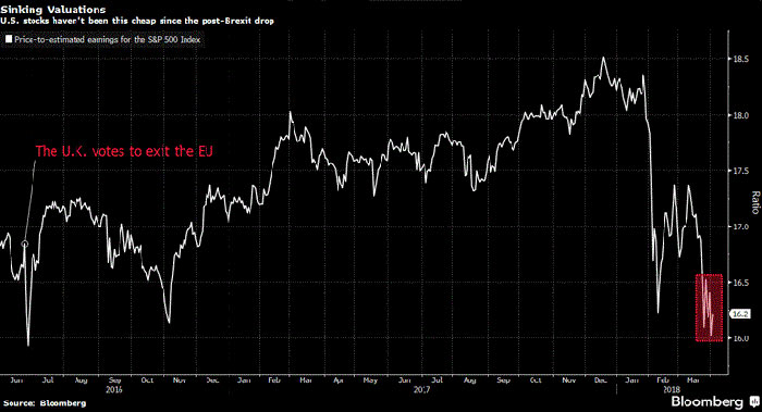
Let’s look at chart No. 2, also from Bloomberg…

Random (or seemingly random) events push the market around all the time. But the last time U.S. stocks were this cheap, Great Britain had just voted to leave the European Union.
So, yeah, things are cheap. Or at least cheaper. And you can start making shopping lists.
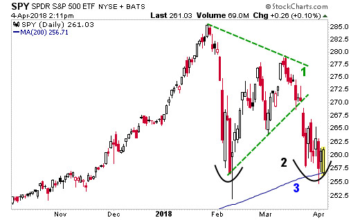
While you’re doing that, when should you look to buy? I have a third chart, which I whipped up on StockCharts.com, to show you that.

This is a variation of a chart I sent my Supercycle Investor subscribers earlier this week. On it you can see…
- The triangle that the S&P 500 was coiling up in until it broke down. That’s bearish.
- The double bottom that the S&P 500 is forming now. That’s potentially bullish.
- The 200-day moving average. This acted like a magnet during the market’s fall. Now this important moving average is acting as support.
I used this chart when I told my subscribers to add some hedge positions — inverse funds that protect us if and when the market goes lower. That’s something short-term traders should do.
But longer-term investors should look at this another way. Let’s focus on the 200-day moving average for a bit.
If the S&P 500 closes below that moving average, most people will tell you that’s bearish. And that can be true. But it would be taking place when the 200-day moving average is rising. In other words, the bigger trend for stocks is higher.
So, if you’re a longer-term investor, a close below that 200-day moving average might be a time to start legging into positions.
Of course, this all depends on your definition of “long term.” And as John Maynard Keynes famously said: “In the long run, we’re all dead.”
1 Way to Play This Market
Let me tell you this. Despite America’s looming trade war with China — a trade war, I’ll remind you, that could end with President Donald Trump’s next tweet — the global economy still looks strong.
So, if you have a longer-term view, the deeper the sell-off, the better the buying opportunity.
That’s one way to play this market. It beats curling up underneath your desk in a puddle of your own puke, that’s for sure.
Mark my words, we could see a big market puke in the days ahead. I’m talking about a dive below the 200-day moving average.
But as long as the 200-day moving average is trending higher, and the underlying fundamentals remain strong, smart money would deploy into that pullback.
Anyway, those are my three charts for longer-term investors. Take them or leave them. But if you’re smart, you’ll be ready to buy when the market pukes.
All the best,
![]()
Sean Brodrick
Editor, Wealth Supercycle


