

Market timing is difficult to do well. Many timers try to forecast reversals, which is a recipe for failure. Others allow the market to tell them what it’s doing. This approach has a better chance of success. The challenge is finding the tool that allows the market to speak.
There are tools that work. But the ones that work aren’t among the most common market indicators.
Common indicators tend to follow market momentum. Some less popular indicators follow breadth. Below is a chart of a breadth indicator, the percentage of stocks that are above their 200-day moving average. The chart, and the timing tool, need some explanation.
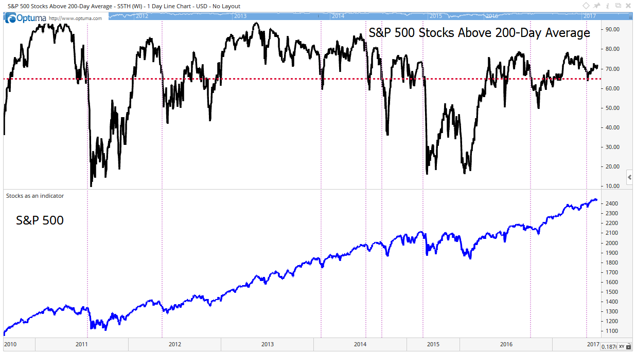
A breadth indicator measures the number of stocks meeting a certain requirement. In this case, it’s the number of stocks above their 200-day moving average. When a stock is trading above that average, it’s defined as being in an uptrend.
The black line at the top shows the percentage of large-cap stocks in long-term uptrends. When at least 65% of the stocks in the S&P 500 are in uptrends, the index itself is in an uptrend. The 65% level is shown as a red dashed horizontal line.
The index is shown as the blue line at the bottom of the chart. Light-red dashed vertical lines show that the index tends to sell off when the timing tool falls below 65%. In the chart, there is always at least a minor sell-off whenever this signal is given.
This isn’t a perfect market-timing tool, but it is useful. For now, it’s bullish, but I’m watching closely.
Regards,
Michael Carr, CMT
Editor, Peak Velocity Trader