
As an analyst, I’m always looking for indicators that give me an edge.
And one of the most important indicators to have is one that tells you when it’s a good time to exit the market.
You know, one that would’ve gotten you out right before the 2008 collapse and told you when it was safe to get back in.
For that I’ve been following a couple moving averages and waiting for crossovers. But besides dodging a great collapse, I realized that this indicator is also good at pinpointing short-term pullbacks, and it is flashing warning signs for one at this very moment.
Take a look:
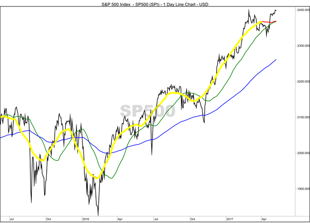
(Chart source: Optuma)
The chart is based on the S&P 500, which is the jagged black line.
In yellow I have the 50-day moving average offset by 25 days. In green is the regular 50-day moving average. But you’ll notice at the top I have a little red line connecting the yellow and green line — that’s the 50-day moving average, but calculated based on a centered moving average.
By using the centered calculation, the chart is constantly updating and giving us an early look into weakness in the market.
The original reason I started following the centered line is because a crossover between it and the 200-day exponential moving average (the blue line) is a great indicator to exit the market. It precedes every major drop.
A crossover happened in September, and we saw a nearly 5% drop from the highs to the lows.
It also happened in June and December of 2015 — the last two significant market pullbacks.
Right now the centered line isn’t even close to the 200-day average, so no worries about a large market sell-off yet.
The current pullback was just 2.5%, and the S&P 500 has reclaimed that decline. But the weakness shown in the centered 50-day moving average means we could still be due for a bit steeper short-term pullback.
Regards,

Chad Shoop, CMT
Editor, Automatic Profits Alert