
In 2012, the Federal Reserve promised to communicate clearly. Of course, clear communications are a relative idea, and the Fed’s clarity falls short of what most of us think the word means. But as market watchers, we take any crumbs of information the Fed gives us.
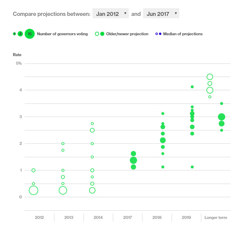
As part of this policy, every three months the Fed publishes the “dot plot.” Below is an example.
In the chart, interest rate forecasts from each of the Fed governors is shown as a dot. This chart shows the current forecast and the dots published in January 2012, the very first dot plot. Open circles show the earlier forecast. Solid green dots are the current forecast.
(Source: Bloomberg)
The longer term on the far right side tells us what the Fed thinks interest rates should average in an ideal world. For now, it expects short-term rates to average about 3%. Banks use this rate to set interest payments for money market funds or short-term certificates of deposit. Before 2008, the rate averaged 5.7%.
The dot plot shows forecasts for rates have come down over time. In 2012, the Fed thought short-term interest rates should average about 4.5%, close to its long-term average. Now, most officials expect rates to stabilize at 2.5% to 3%.
This is devastating news if you’re hoping to retire someday. Low rates mean investors are forced to take higher risks to generate income. It also indicates inflation is expected to stay low. So, cost-of-living adjustments for pensions and Social Security payments will remain low.
The Fed is telling us we may never again see risk-free income of 5% or more. There is some good news, however. This supports much higher prices for the stock market in the long run. Dow 50,000 within a few years remains possible.
Regards,

Michael Carr, CMT
Editor, Peak Velocity Trader