If you’ve ever lived in South Florida, there’s one thing that stands out — traffic is horrendous.
This isn’t New York City where everything is within a few blocks. Everything is miles apart down here.
Yet every time I hop on a highway, there’s a traffic jam.
I am constantly using my GPS navigation to notify me if there is an accident ahead or if there is a better route.
But I also find myself competing against the navigation itself.
If, according to the navigation, it is supposed to take me 30 minutes to get home from work, I want to arrive sooner than that.
I guess it’s just my competitive nature.
The navigation shows the average arrival time … but I am not an average person.
I always seek to outperform averages, including with my investments — no one wants average results.
To outperform the average consistently, you need to have a good method of picking winners and losers … and I have one to share with you today…
It’s All About Rotation
While everyone has their own unique investment tools, one of my favorite market indicators is the relative rotation of the various sectors.
To beat the average, I need to be able to determine which stocks are leading, weakening, lagging or improving. The weekly Relative Rotation Graph™ below puts this into a visual concept that’s easy to comprehend.
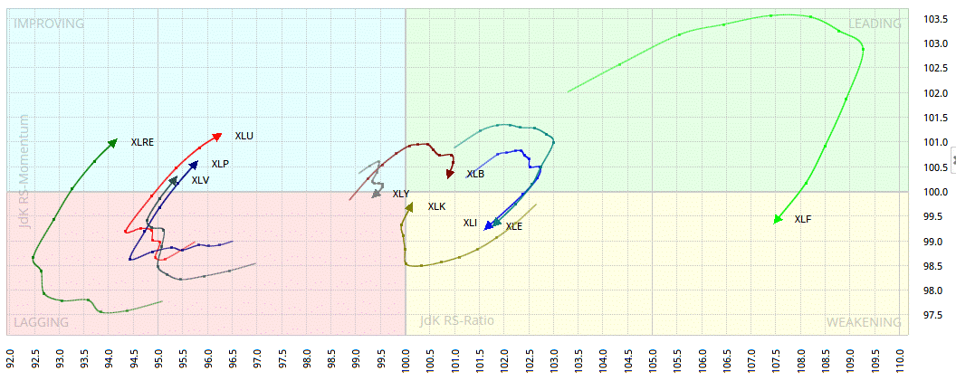
(For more information on the sectors in the chart, click here.)
This may look like just a bunch of squiggly lines running around at first, but there is a distinct clockwise rotation going on.
If you are having trouble with the visual, don’t worry. There is a lot going on in one graph … so let me explain:
- The center of the graph represents the S&P 500, or the average return of the sectors.
- The shaded area in the blue bar at the top indicates the date.
- If a sector is in the top right (green), it is leading the market, or outperforming.
- If a sector is in the bottom right (yellow), it is still leading but has started to weaken.
- If a sector is in the bottom left (red), it is lagging the market, or underperforming.
- If a sector is in the top left (blue), it is lagging but improving against the market.
Note that the chart is partly thrown off in November, as the sectors paused, waiting on the U.S. election, and then broke out afterward. Now you can see that those sectors are already starting to rotate again.
Picking Winners and Losers
To break it down a bit, relative rotation is a combination of two things:
- A specific sector’s relative performance compared with the index (the S&P 500).
- The momentum of the sector’s price changes.
Think of it like this: If all the sectors of the S&P 500 make up the average, it’s difficult to find the few out of that bunch that will outperform the S&P 500 at any given time.
One sector can’t continuously outperform or underperform, as this will influence the average … causing other sectors to outperform and underperform.
This is what creates the rotation in a Relative Rotation Graph™ — and it makes it visibly easy to pick winners and losers.
A Clear View
The relative rotation concept was developed by Julius de Kempenaer of RRG Research (which owns the trademarks for it) back in 2004. He designed Relative Rotation Graphs™ for one simple reason — to show institutional investors a clear view of leaders and laggards in the market.
I think he accomplished that.
And I’ll take it one step further … and give you an easy way to pick winners and losers.
Since there is a steady rotation, you can pick winners and losers by grabbing stocks as they enter the improving section in the top left (blue) and selling them as they enter the weakening section in the bottom right (yellow).
Using that template, you will want to have more exposure to sectors that are improving — real estate, utilities, consumer staples and health care. These sectors have been lagging and are starting to improve, meaning momentum is picking up, and, relatively speaking, the sectors aren’t underperforming as much.
The sectors you want to limit your exposure to are the ones that are weakening — financials, energy and industrials. These are sectors that have been — and still are — leading the market. But their momentum is fading, and they could soon fall and lag the market.
There are countless ways to trade based on this one simple graph, and it is something I continue to study and analyze. But it’s clear that this concept of counting on the rotation aspect to play out is helpful when it comes to asset allocation.
The graph moves on a weekly basis, so you can make these changes and look to ride it out for a few weeks.
Regards,
Chad Shoop, CMT

Editor, Automatic Profits Alert