Price charts show what investors think about the market. Almost always, charts show fear.
Some investors live in constant fear. Whether prices are moving up or down, some investors either fear a loss in a downturn, or they fear missing out on gains in an uptrend.
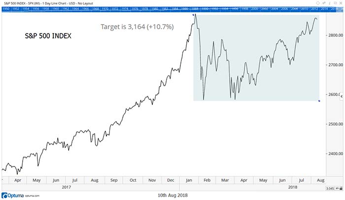
Chart patterns help identify times when fear turns into action. In the chart below, a fear of missing out is set to kick in. And the buying unleashed by that fear will push prices to new all-time highs.

The rectangle highlights the price action since the S&P 500 Index’s last all-time high.
At the end of January, investors feared losses, and they sold quickly. Then in March, investors feared missing out on gains. So, they bought when prices reached the lows set in January.
The uptrend since that bottom has been steady. That tells us many investors are sitting on the sidelines. If they feared missing out on gains, we would see a rapid advance like we did last December.
A new high will bring fear of missing out. That will pull investors off the sidelines.
What to Expect
The chart can help us determine what to expect when investors start rushing into the market.
Technical analysts look for symmetry in the markets. That principle helps find price targets.
If symmetry holds, the move after an upside breakout will equal the size of the previous decline. That principle provides a target more than 10% above the current price.
That’s only an initial target. Gains tend to feed on themselves. As prices rise, more and more investors fear that they’ll miss out. This leads to a “melt-up” where prices accelerate higher.
Eventually, buyers put all their money to work. Then the market, in effect, runs out of buyers. That’s when prices will fall.
We are far from that point. There are trillions of dollars on the sidelines right now. And all that money will drive prices up as it’s put to work in the stock market.
Regards,

Michael Carr, CMT
Editor, Peak Velocity Trader


