
Technical analysis is the study of prices, and it can be applied to any price data. This allows for unique insights into the housing market, for example. Right now, the picture for home prices is bullish.
There are many reasons why home prices should rise. Demographics point to years of gains. My colleague Paul recently wrote about this phenomenon in his article “92 Million Reasons to Invest in Housing.”
Fundamental analysis indicates that homes are slightly undervalued. This is based on long-term indicators such as the price-to-income ratio. Technical analysis confirms that the bull market could run for years.
The Bullish Bandwagon
Prices in any market tend to trend. This is true for both stocks and homes. Once price gains begin, they are often followed by more gains. Likewise, price declines are usually followed by more declines. Home prices have just started rising, as the chart below shows:
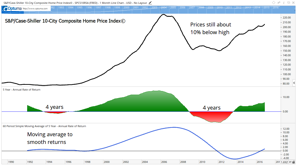
This is a chart of the S&P/Case-Shiller 10-City Composite Home Price Index. There’s a more popular 20-city version of the index, but data for it is only available from 2000 onward. I used the 10-city index because it provides more history; however, the general trend is always the same in both.
In the chart, we see an uptrend that began in 1996. It lasted 10 years, until 2006. A four-year bear market came before and after the uptrend.
To measure the bear market, I relied on two indicators.
In the middle of the chart is the five-year annualized rate of change (ROC). This shows how much prices changed over the preceding five years.
I used five years because this is about the average amount of time that a mortgage is outstanding. If I used longer periods, such as 10 years, the returns would show bigger gains because longer periods hide trends. A 10-year ROC misses that first bear market, for example.
Homeowners are sensitive to short-term price changes. I believe that they notice a five-year period of declining values, so that’s a good time period to use.
Anyway, back to the chart. At the bottom is a five-year moving average (MA) of the ROC. An MA smooths the data and makes it easier to spot the trends.
In this case, the MA looks like a fluctuating sine wave. This makes sense because prices trend, and the trend in home prices is driven by demographics. Demographics, such as the number of people in an age group, change slowly over time.
A Top Trend for Trading
The MA shows that we have reached a bottom in the home market. It also tells us to expect gains for years.
The uptrend will be driven by millennials buying homes. There are millions of millennials set to move out of their parents’ basements. They need homes, and this demand will increase prices.
Now, what does this have to do with the stock market?
Economists found a “wealth effect” in housing. Higher prices make homeowners feel wealthier. They spend more when home prices are rising, and spending fuels stock market gains.
Looking at where we are in the housing market cycle, we should see years of gains in that market. And this should translate to years of gains in stocks.
Regards,
Michael Carr, CMT
Editor, Peak Velocity Trader