
Stocks can be grouped by size. This idea uses market capitalization, or the number of a company’s shares multiplied by its share price.
Most well-known stocks are large caps. For example, Apple Inc. (Nasdaq: AAPL) has more than 5.2 billion shares outstanding and a share price of about $150. This gives Apple a market cap of about $798 billion. By this measure, Apple is the largest company in the world.
Popular measures of the stock market only look at large caps. The S&P 500 Index includes the 500 largest stocks in the stock market, which means the index ignores thousands of stocks. There are 3,698 stocks trading above $5 a share with market caps too small to be included in this index.
Most of the market consists of small-cap stocks, so tracking small-cap indexes offers important insights into what stocks are doing. And right now, small caps are performing worse than large caps, which is a sign of weakness in the broad market.
Danger Ahead
The relationship between small- and large-cap stocks is shown in the chart below. At the bottom of the chart is a measure of the relative strength of small caps. As its name tells us, relative strength shows which group is the stronger of the two. In the chart, a specific indicator, the momentum of relative strength, has just turned down, warning of potential weakness in small caps.
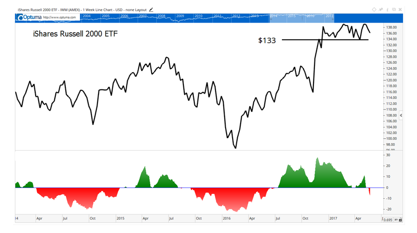
This is a chart of the iShares Russell 2000 ETF (NYSE Arca: IWM), an exchange-traded fund that tracks the most popular small-cap index. The largest stock in this index is Advanced Micro Devices Inc. (Nasdaq: AMD) with a market cap of less than $11 billion … about 1.3% the size of Apple. The smallest companies in the index have market caps below $150 million, or less than 0.2% the size of Apple. Altogether, the 2,000 stocks in the index account for about 8% of the U.S. market’s market cap.
Despite the small size of these companies, IWM can help us determine how bullish investors are. When investors are optimistic, they tend to buy these small stocks. When they fear a market decline, they generally stick to large caps, which usually suffer less in bear markets.
In the chart, the indicator at the bottom shows whether or not investors are bullish on small caps. In technical terms, the indicator measures the rate of change of the relative strength of small caps compared to large caps. When investors are bullish, the indicator is above zero, shown as green in the chart. Negative readings, shown in red, relate to bearish sentiment and price declines.
You can see in the chart that small caps make large gains when the indicator is green. This indicator has been weak since the end of April, as investors began wondering whether they should “sell in May” as the popular adage advises. While that seasonal tendency isn’t enough of a reason to turn bearish, the breakdown of small-cap stocks’ relative strength adds to the danger.
Should we sell in May? Ultimately, we trade prices rather than indicators. Even though the indicators are bearish, prices are near a new high. A breakdown in IWM below its recent lows, near $133, would provide a sell signal.
Until prices break down, the momentum of relative strength indicator shown in the chart is warning us to be ready for a decline.
Regards,
Michael Carr, CMT
Editor, Peak Velocity Trader